Raga AI
Ivy – Healthcare Cost Assistant
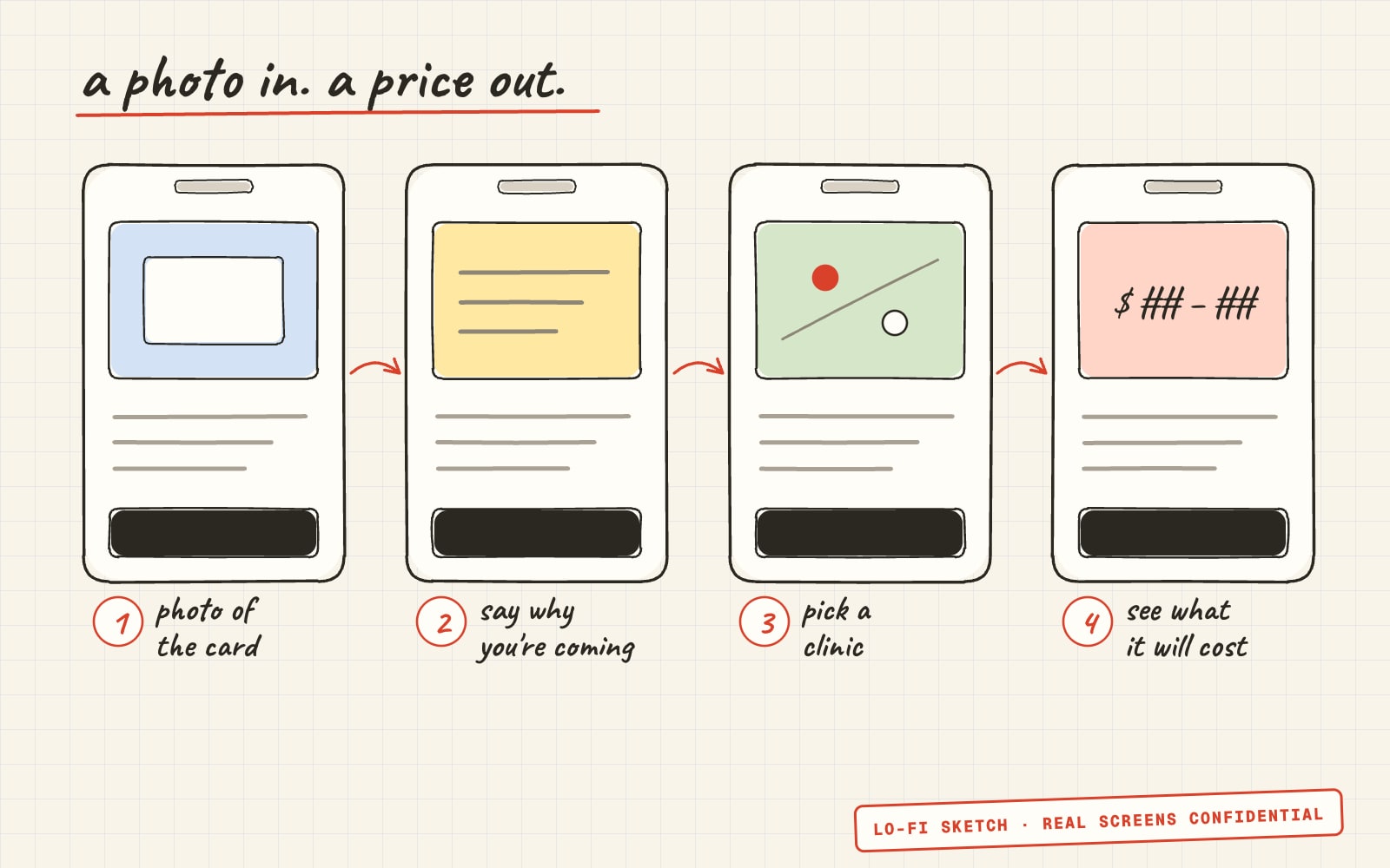
Ivy is Raga AI's app for patients of allergy clinics. A patient photographs their insurance card, says why they're coming in, picks a clinic, and sees what the visit will cost them, line by line. I built the first version on my own in two days, from the product spec to an Android build: the estimate engine, the design system, every screen, the tests and the API integration. The team then went forward with a teammate's UI, and I moved clinic comparison, location search and screenshot protection onto it.
Introduction
Project description
Ivy is Raga AI's healthcare cost assistant for patients of allergy clinics. Raga AI's main product checks insurance benefits for clinic staff. Ivy answers the patient's own question before they book: what will this visit cost me?
I built the first version alone in October 2026, from the product spec and a set of screen mockups to an Android build running against the real API, in two days. The team then went forward with a teammate's UI, and I moved clinic comparison, location search and screenshot protection onto it.
- Timeline
- October 2026. v1 in two days, October 5 and 6, then the move to the team's build.
- My role
- Designed and built v1 alone: estimate engine, design system, screens, tests, API integration and builds. Then new features on the team's build.
- Team
- A teammate who built the UI the team went forward with, and Raga AI's backend for card reading, coverage checks and pricing.
- Platforms
- iOS and Android from one React Native codebase, and later a web build.
01The problem
Patients don't speak billing codes
Raga AI's core product checks a patient's insurance benefits for clinic staff. The product spec for Ivy turned that around: let the patient find out what a visit will cost before they book.
The catch, as the spec put it, is that patients don't know CPT codes, their diagnosis codes, or which procedures they'll need. So the app has to solve three translation problems before an estimate can run.
Who is this patient?
A photo of the insurance card has to become a member ID, an insurer and a coverage check, without making the patient type what's already on the card.
Why are they coming in?
“I need allergy testing” has to become a bundle of billing codes, each with a typical range of units.
What will it cost here?
Each clinic's agreed prices, run through the plan's deductible, copays and coinsurance, have to give a range the patient can trust, not one number that turns out wrong.
02The app
From a card photo to a cost
Five steps, each in the patient's words, with the insurance work happening behind them.
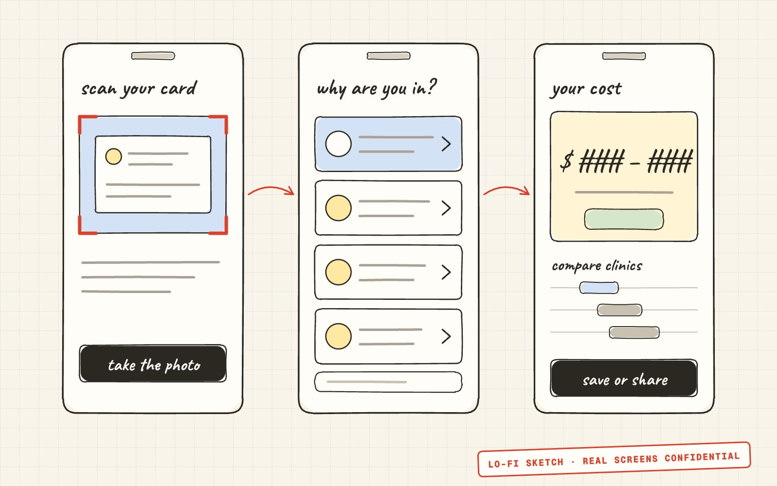
Scan the card
A full-screen camera with a card-shaped guide. The coverage check starts as soon as the card is read.
Check the details
Anything the reader wasn't sure of is flagged, and coverage is usually confirmed by the time the patient has read it.
Say why you're coming in
Pick one of nine reasons in plain words, or type your own and let the assistant pick.
Pick a clinic
Every nearby clinic shows its estimate up front, and any two to four can be compared.
See the estimate
A range, a line for each service, the plan rules behind it, and a PDF to save or share.
03What I built
The parts I owned
Card capture
A full-screen camera with a card-shaped guide, a torch and a gallery option. After each photo the patient checks the text is sharp, and the camera's exposure data flags likely glare before the card is read.
- Fields the card reader wasn't sure of are marked “Please check”
- Card photos are deleted from the phone right after upload
Coverage in the background
The coverage check starts as soon as the card is read, so it's usually back by the time the patient has checked their details. It runs again if they change their member ID, insurer, name or date of birth.
Visit reasons in plain words
Nine reasons a patient would recognise, like “I need allergy testing” or “I'm starting a biologic”, mapped to eight treatment bundles of billing codes and typical unit ranges. Patients can also type their own words and let the assistant pick the closest match.
- Bundles live in a JSON file checked with Zod, so the clinical team can change them without touching screens
- A test fails if a billing code ever appears in patient-facing text
Estimate engine
Pure TypeScript with no React, working in whole cents and following the order insurers process a visit.
- One deductible shared by every line, applied to the most expensive services first
- The out-of-pocket maximum checked after every line
- Copays capped at the clinic's price, with copay rules set per plan
- A low and a high estimate from each service's typical unit range
- A missing price shows as unavailable and lowers confidence; inactive coverage gets a plain message, not a number
An estimate you can check
Tap any line to see its price and the rule behind it. “How we calculated this” walks through the clinic's prices, the plan's rules, what a typical visit includes and how sure the estimate is, and a bar shows the deductible left before and after the visit.
Clinic comparison
The same visit priced at two to four clinics: the lowest called out, every clinic on one price scale, and differences as ranges, like “about $61 to $120 more”. Overlapping ranges, or gaps under $5, are called about the same.
- A per-service view switches between the patient's cost and each clinic's agreed price
- The estimate screen says when a nearby clinic is clearly cheaper, and by how much
Private by default
Patient details live only in memory and clear on Start over, after 10 idle minutes with a one-minute warning, and when the app closes. Screenshots are blocked on the card and estimate screens, there's no analytics, and the PDF and share text leave out the member ID and date of birth.
Readable in bright light
Text contrast of at least 7:1 (8:1 in high contrast), 17pt body text, 48pt touch targets and 56pt main buttons. High contrast follows the phone's setting, there's a dark theme, and animations respect Reduce Motion.
04The spec
Where the spec didn't add up
I built from the product spec and a set of ten screen mockups. Building the estimate engine meant testing the spec's own numbers, and some didn't hold. I wrote down each conflict, the decision I took and the question it left for the product and clinical teams, instead of quietly picking one.
The worked example
The spec's sample came to $107.58 with $679 of deductible left. That only works if the deductible doesn't apply. With $679 left, the same visit comes to $377.90. The engine follows the rules, and the tests show both cases.
Copays and the deductible
The spec's pseudo-code took deductible before checking for a copay, so a $40 copay visit would quietly use up deductible the patient never paid. The engine doesn't, and both behaviours are a per-plan setting.
Shots are a course, not a visit
“Starting allergy shots” means 26 visits. It's estimated as the full build-up course, labelled that way, with copays per visit.
Readability over the mockups
Where the mockups and the readability rules differed, readability won: larger text, darker colours to reach 7:1, and Raga AI's brand in place of the mockups' teal.
05The estimate
An estimate you can check
An estimate only helps if the patient believes it. So every number can be opened up: tap a line for its price and the rule behind it, or open “How we calculated this” for the whole method in four short steps.
A confidence label says how sure the estimate is. When coverage is inactive or a price is missing, the app says so plainly instead of showing a number.
06Comparing clinics
The comparison the spec saved for later
The spec called comparing clinics the killer feature, then left it out of v1 to keep the first version small. It was added at product request, and I built it on the same engine: the same visit, priced at two to four clinics with each clinic's agreed rates.
The hard part was the wording. Estimates are ranges, so “cheaper” needs care. Differences are shown as ranges, overlapping ranges or gaps under $5 are called about the same, and every clinic sits on one scale starting at $0, so a short bar never exaggerates a small gap.
07Access & privacy
Readable in a waiting room, private by default
Patients use this on their own phones, often in bright light, and the app holds their insurance details. Both shaped the design system from the first commit: the first test in the repo checks colour contrast.
Contrast that can't slip
Every text colour pair in the light, dark and high-contrast themes is checked by a test. Below 7:1, the build fails.
Big enough to use
17pt body text, 48pt touch targets and 56pt main buttons, and text that follows the phone's size setting.
Never colour alone
Selected and status states use a thick border, an icon and a label.
Gone when you're done
Details live only in memory and clear on Start over, after 10 idle minutes, or when the app closes.
08The final app
Moving onto the team's build
The same evening v1 was connected to the real API, a teammate's version of the app, built in parallel and closer to the mockups, became the one the team went forward with. Rather than keep two apps, I moved my work onto it.
Four clinics, not two
The team's build compared two clinics. I extended it to four, with a “Compare prices nearby” shortcut that picks the nearest, and range bars on one shared scale.
A nudge on the estimate
A “Compare rates nearby” card on the estimate screen that prices the same visit at the closest clinics.
Screenshot protection everywhere
On Android, screenshots and recordings are blocked. On iOS they come out blank, the app-switcher preview is blurred, and a message tells the patient to use Share instead.
Location and a web build
“Use my current location” on the clinic search, and a web build with an install manifest, a browser-safe card upload and location by coordinates.
09Challenges
The hard parts
Most of the work was in making an estimate honest, and in shipping against a backend that was being built at the same time.
Estimates, not promises
A wrong single number is worse than an honest range. Low and high estimates come from each service's unit range, confidence drops when a price is missing, and coverage problems get a plain message instead of a guess.
Going live one endpoint at a time
A hybrid mode sends chosen endpoints to the real API and keeps the rest on demo data. Card reading went live first, and the rest of the flow followed the same afternoon.
An upload that said “offline”
Expo SDK 57's fetch doesn't accept React Native's old file objects, so the card upload failed before reaching the network and showed an offline error. Reading the photo through expo-file-system fixed it, and only real network failures say offline now.
Two versions of one app
Two builds of the same product appeared on the same day. Moving my comparison and privacy work onto the team's build, rather than defending mine, kept it to one app.
10Outcome
Where it got to
In two days, v1 went from a spec to an Android build running the full flow against the real API, with 309 tests passing. The team went forward with a teammate's UI, carrying my comparison, location search and screenshot protection, with Android, iOS and web builds.
The open questions went back to product with the code: which numbers the worked example should show, how each insurer treats copays, clinical sign-off on the bundles, and how to price biologics and a six-month course of shots.
Engineering notes
- Expo SDK 57, React Native and strict TypeScript, with Expo Router for the flow; one codebase for iOS and Android, built with EAS and a local APK script
- A typed API client with a mock twin and a hybrid mode: chosen endpoints go to the real API while the rest use demo data, so the app went live one endpoint at a time
- Every API response validated with Zod before use; patient details only travel in request bodies, never URLs
- Session state in a Zustand store that's never written to disk, and clinic estimates loaded with TanStack Query
- Card upload fixed for Expo's new fetch, which doesn't accept React Native's old file objects: the photo's bytes are read through expo-file-system
- Every text colour pair in every theme checked by a test that fails below 7:1
- A release guide, App Store and Play privacy answers, and a HIPAA checklist (vendor agreements, data retention, security review) written alongside the code
Impact
- From product spec to Android build in two days
- 309 automated tests, including a 7:1 contrast check
- Up to four clinics compared on one price scale
- Card reading, coverage, clinics and pricing from the real API
Looking for a Senior Frontend Engineer who can ship platforms like this?